Workshops
June 6-7, 2018
| VecchiaStamperia | Ewan Clayton | Bruno Maag & Richard Bailey | Rainer Erich Scheichelbauer, Laurence Penney & Georg Seifert |
Damiano Bandini loves letterpress, and movable types. This is why he still runs an old letterpress workshop in downtown Faenza, carrying on passion and knowledge handed down from father to son.
La Vecchia Stamperia is a historic workshop (Bottega Storica dell’Emilia Romagna): everything started in 1920, so this workshop has been printing movable types on paper for more than 90 years – and counting.
He has got one of the largest collection in use, of very rare metal block-prints and unique artistic wood ones.
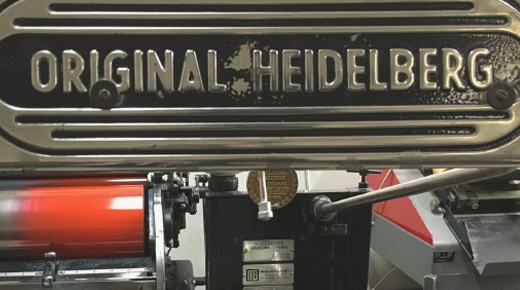
Did you buy a Heidelberg Windmill — or “Stella”, as we lovely call it in Italy — and all you need is love… sorry, experience to become a professional letterpress printer? Join us in Faenza and Damiano Bandini will share a lot of secrets with you!
You’re a proud owner of a Heidelberg Stella, and you’re going to become a professional printer, we know! Or you'll try, at least…
Will you mainly print texts composed with a lead type or will you also use a lot of images? And what about cliché and xylography? You have to prepare your Stella in different ways, starting with the right packing. Set the preparation the wrong way, and you’ll have more than some troubles.

Ewan Clayton is a calligrapher and Professor in Design at the University of Sunderland, he is also a visiting calligraphy tutor on the type programmes at the University of Reading and Cooper Union in New York City. He is a core staff member at The Royal Drawing School in London. Lettering is in his blood. He grew up near the village of Ditchling in the UK, home to Edward Johnston and three generations of his family worked there in a guild of crafts people founded by Eric Gill.
Ewan’s interest in the written word ranges widely. He worked for 12 years as a consultant to Xerox PARC, researching the future of writing in the workplace.
His book on the history of writing with the Roman alphabet The Golden Thread was published in 2013 and has been translated into a number of languages, including Italian.
His real love is articulating the role the entire body plays in writing whatever the medium; he is a qualified somatic coach and body-worker.
Fluent styles of movement characterize good letterforms, they extend our creativity and encourage the emergence of personal expression.
In this workshop, suitable for designers of all levels, we will experiment, in a structured way (following in the footsteps of Rudolf Laban), with different movement styles.

Bruno began his career with an apprenticeship as a typesetter at Tages-Anzeiger, Switzerlands largest daily newspaper. He then studied Typography and Visual Communcations at Basel School of Design under Wolfgang Weingart and Andre Gürtler amongst others. After graduating Bruno emigrated to England to work for Monotype where he established their ‘custom type department’, creating fonts for the New Yorker magazine, and others.
Richard’s background is in corporate services, but since joining Dalton Maag he’s diversified into developing the design service offering and improving the client experience.
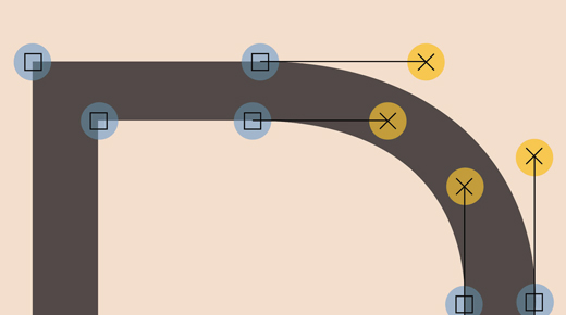
Two day workshop on a professional approach to designing a typeface.
In the workshop Tom Foley and Bruno Maag will explain an effective and efficient approach to designing a typeface (family). The participants will learn how to define the requirements, aesthetically, technically, linguistically, and how to setup the design process.
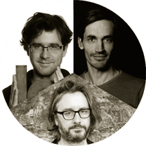
Bauhaus University graduate Georg Seifert (b. 1978 in Halle an der Saale, Germany) is a type designer and a software developer. His typeface families Graublau Sans and Graublau Slab have become international bestsellers. He co-developed the typeface for the new Berlin Airport. He is most well known, however, for the font editor ‘Glyphs’, first released in 2011. Seifert lives and works in Berlin.
Laurence Penney is a consultant in font technology based in Bristol, UK. Focussed on dynamic type tech, he specialized in TrueType: coding rasterizers, hinting fonts, and training others how to hint fonts. He later took on the challenge of creating MyFonts, the open platform selling fonts from all foundries, part of the team that made it market leader by a wide margin.
A trained photographer, Rainer Erich (‘Eric’) Scheichelbauer (b. 1977 in Vienna, Austria) holds both a philosophy and a Dutch studies degree. He creates typefaces, works as a digital punchcutter for other type designers, and gives type design workshops on a regular basis.
One day workshop to learn to build a variable font.
Variable Fonts: the future of type. Learn how to build a variable font in Glyphs, and make it animate, even. You will learn how to set up font projects in Glyphs, add variable font axes to it, and walk home with an emoji animation and a variable font with a few letters and a few axes. You will test it in Axis Praxis, get it to work properly in the latest Adobe apps, and animate it with a little HTML and CSS in a web browser.
